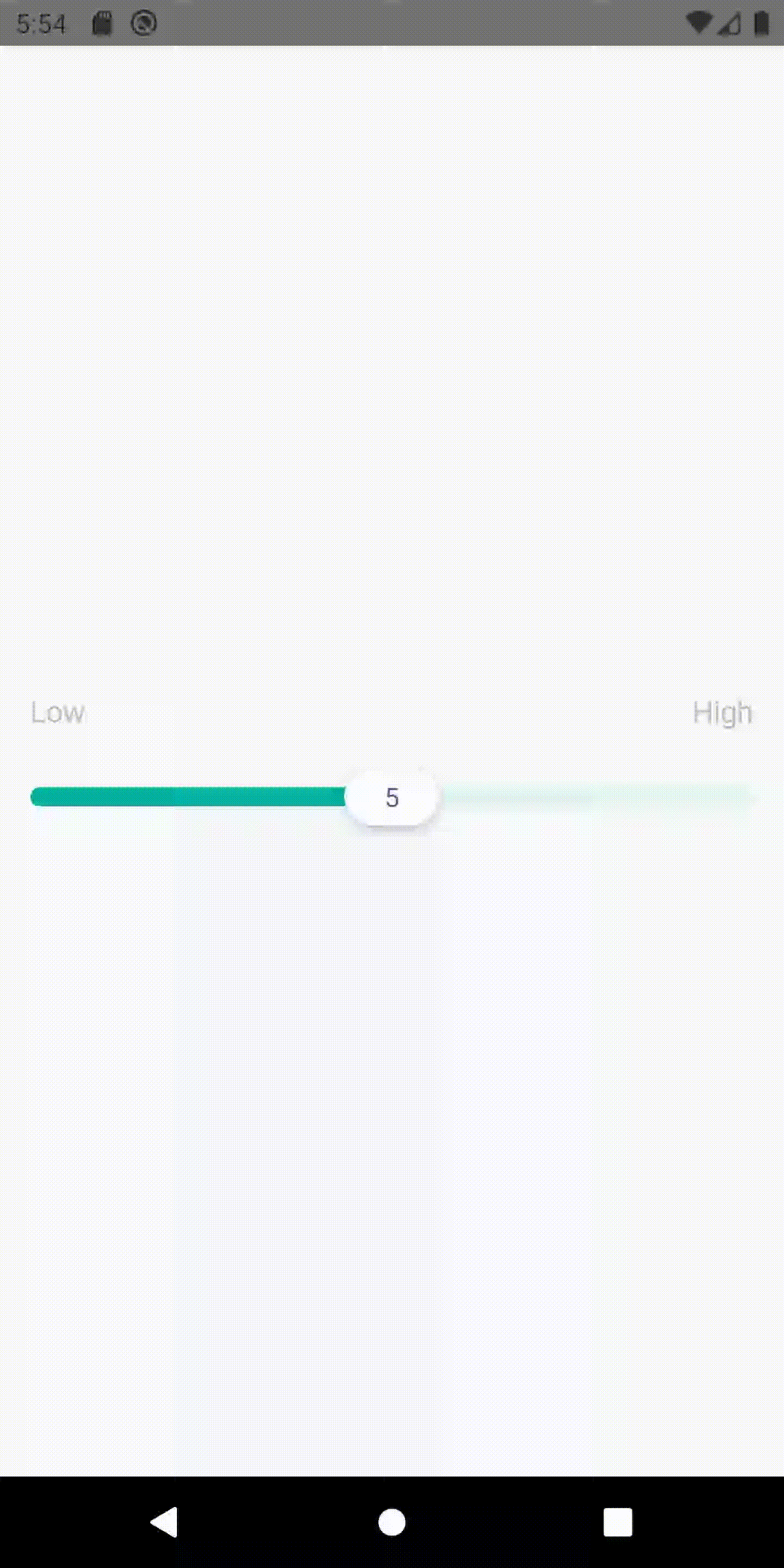
Property
Type
Default
Description
tooltipText
string | undefined
Calculated value
Text to show inside the tooltip
thumbStyle
StyleProp | undefined
-
Style for the thumb
thumbTextStyle
StyleProp | undefined
{
  color: '#535D7E',
}
Text style for the thumb
trackStyle
StyleProp | undefined
{
  borderRadius: 5,
  height: 10,
}
Style for the track
tooltipContainerStyle
StyleProp | undefined
{
  height: 49,
  width: 49,
  backgroundColor: theme.colors.dusk,
  position: 'absolute',
  top: -75,
  borderRadius: 24,
  justifyContent: 'center',
  alignItems: 'center',
}
Style for the tooltip text container
tooltipStyle
StyleProp | undefined
{
  color: 'white',
}
Style for the tooltip text
leftTextStyle
StyleProp | undefined
{
  opacity: 0.8,
}
Style for the top left text
rightTextStyle
StyleProp | undefined
{
  opacity: 0.8,
}
Style for the top right text
containerStyle
StyleProp | undefined
-
Style for the component container
sliderContainerStyle
StyleProp | undefined
-
Style for the slider component container
topTextsContainerStyle
StyleProp | undefined
-
Style for the container of the texts on the top left and the top right side of the
component
sliderStyle
StyleProp | undefined
-
Style for the slider itself
sliderTouchableStyle
StyleProp | undefined
-
Style for the TouchableWithoutFeedback component around the slider
minimum
number
-
The minimum number value for the slider
maximum
number
-
The maximum number value for the slider
onValueChange
(value: number) => void
-
Event for value change
onSlidingStart
() => void | undefined
-
Event that is fired when the sliding starts
onSlidingComplete
() => void | undefined
-
Event that is fired when the sliding completes
thumbWidth
number | undefined
-
Width for the thumb
existingValue
number | undefined
minimum value
The value that the slider first renders with
value
number | undefined
-
Current value
leftText
string | undefined
-
Text for the top left
rightText
string | undefined
-
Text for the top right
showTooltipAlways
boolean | undefined
false
Whether to show the tooltip all the time
showTooltipOnSlide
boolean | undefined
true
Whether to show the tooltip or not during drag
step
number | undefined
-
Count of steps for the slider
tintColor
string | undefined
'#00B4A7'
Tint color for the filled part of the track